Annoying typefaces are used every day by most of us in one way or the other but we don’t quite realise how bad they really are. It might be a CV you are updating, a personalised canvas print with wording on it or a simple good old fashioned letter you are typing. Whatever it is you are creating, you will need to be very careful about the typeface you use. Below we have listed a few reasons why NOT to choose certain typefaces.
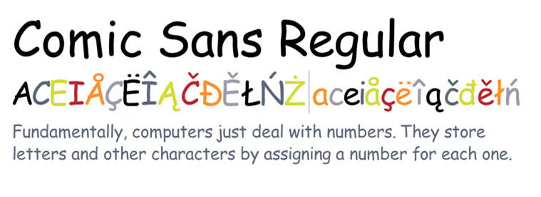
Comic Sans

The hatred for this font typeface runs so deep that it inspired a Ban Comic Sans Movement, which has been rallying for its abolishment since 1999. Over a decade later, it’s still the go-to choice for those who don’t know better. Used for anything that needs to look in any way informal: from shop signs to menus, to brochures. Comic Sans’ availability on all Windows PCs has allowed it to spread like an unpleasant rash throughout amateur (and, shamefully, some professional) design.
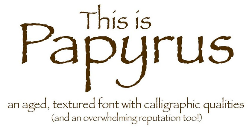
Papyrus

If Comic Sans is informal, friendly and fun, then Papyrus is exotic, unusual and stylish. The problem is that Comic Sans is none of these things – and neither is Papyrus. Another example fallen prey to the trappings of overuse, this typeface is seen everywhere – probably the largest culprit being restaurant menus. It is also commonly used in the slew of Buddha quotes framed put up as wall art.
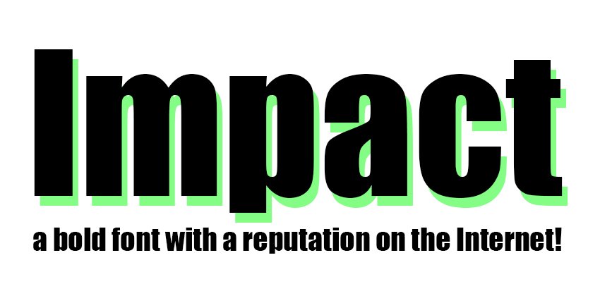
Impact

Impact. The name says it all. Used on billboards, headlines and ‘Do Not Enter’ signs to name a few. It might be effective, but that does not make it any more pleasant to look at. Or any less open to abuse by the same sorts of people who feel the need to spell everything out in capitals in the subject lines of emails.
Impact received notoriety most notably on the internet through its use in image macros of cats, originating on the I Can Has Cheezburger blog. This has made it somewhat difficult to take seriously ever since.
Mistral

If you’re looking for retro handwriting chic, look no further than Mistral. And then notice how awful it is and choose something else instead (and no, not Brush Script either).
A mainstay of wedding invitations, advertising and mediocre product design targeted at women, Mistral is not only clichéd, but the characters don’t even join up correctly. It may have been designed to look classy and elegant, but it now comes across as clumsy and dated.
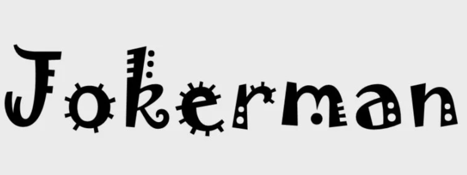
Jokerman

There is perhaps one solitary situation where Jokerman could be deemed acceptable or even appropriate. And that is on a children’s birthday party invitation. In no other scenario could the use of this over-decorated, mostly illegible typeface possibly be justified – which then begs the question why it crops up in so many incongruous places.
How to Choose the Right Typeface for Your Canvas Prints?
Most homeowners these days like to add large size photo canvas prints to their interior décor. After all, these beautiful paintings can set up some charming and vibrating appeal in the premises. Moreover, guests will also love to see the wonderful collection of paintings and photographs at your home.
Some of you may like to add images from your outdoor events, family gatherings, and vacation hours into canvas frames. However, many others consider using landscape pictures from nature for home décor. One of the most common choices for the modern age office and home décor is quotes on the canvas prints. You can find some pre-designed inspiring quotes containing canvas prints in the market or can take help from professionals to design a custom canvas with your favorite message or quote on it. Modern technologies make it pretty simple to create a tailor-made canvas for your reading room, living room, or bedroom. However, you have to be more careful about the appearance and readability of these quotes on the canvas. In this process, it is advised to put more emphasis on the typography choices.
No matter whether you are going ahead with a simple and subtle design or wish to create a bold layout with memorable impact, you may always need to consider the trade-offs between different typography options. Making a selection for the right font to lead your new canvas print project may appear exhilarating. But this process involves several major challenges. Don’t worry! Here we are going to provide a detailed guide on how you should identify the best typeface for your project.
Tips to choose the best typefaces for your bespoke canvas prints:
Making a selection for the best font can be tricky. You may have to evaluate several aspects including the trade-off between complexity and beauty of type. But there are so easy-to-follow rules that you can go through for making the most appropriate decisions.
Tip 1: Think about your goal:
The first thing you need to do for picking up the best typeface is to create a strong impression in the mind regarding what you wish to present to your audience. You may have some expectations on how the viewers should react when they see the canvas print. The same impression you have to create with the selected fonts. In general, your first preference would be to maintain both the readability and legibility of the message while keeping it simple to understand for the audience. You can even think of creating a mix of two or three different fonts but for this, you need to understand the subjective and objective elements of the quote. It will help you create the perfect mixture of font types for canvas.
Tip 2: Work on overall legibility
Many people use terms legibility and readability interchangeably. But they have different definitions and importance levels in canvas font selection. Legibility mainly refers to typeface design which includes stroke width, serifs, and novelty in the design elements. Decorative typefaces generally have low legibility; however, typefaces commonly used in magazines, novels, and newspapers offer high legibility. Experts advise choosing fonts with conventional letterforms instead of using fonts with excessive ornamentation, artistic deformation, and unique shapes. Also, fonts must have generous spacing with recognizable sentence structures.
Tip 3: Readability plays an important role
When you make a detailed analysis of the goal and legibility of your canvas print fonts, it will automatically guide you to achieve the desired level of readability. In general, readability can be defined as a dynamic interaction between type size, style, color, leading, and many other properties. They act together to maintain a certain degree of readability. You should focus on maintaining the high readability of text so that your message doesn’t look complicated to the audience. Understand the purpose of typefaces before making a selection; there are generally different options for headlines and body copy. You have to be more careful with multi-line texts while maintaining generous space between lines.
Tip 4: Versatility makes your canvas long-lasting
While making a selection for the canvas print typefaces, you should start with superfamily groups. They have a highly versatile collection of fonts with unique styles and appearances. It is also possible to combine different sets of typefaces from these versatile groups. Your crafted work should lead to harmony and maintain the desired level of visual cohesion. It should set a consistent tone with more flexibility and a clear hierarchy. Depending upon the message you want to print, you can check the impact of italic, regular, and bold styles.
Tip 5: Look for high contrast
In order to choose the most influential fonts for your canvas prints, you should focus on some high contrast options. There is no need to pick similar kinds of fonts, you can go with dramatic variations of unique combinations of serif and sans fonts. Don’t forget to analyze the contrast setting between design canvas and font selection. You may have to emphasize color choices as well because all these elements play important role in establishing contrast of the canvas. Make sure that fonts are readable and they can set desired tones for the project. If you are designing canvas prints for the office, it is good to match the contrast and color with the brand personality. It may create a positive impact on visitors and customers.
Along with all these tips, you can also consider the priorities of your brand. Sometimes, it is even good to break the rules that can bring something more impressive out of your custom photo canvas prints. Try to evaluate different options online and then make intelligent selections based on the main goal behind the design. Your canvas print should help you express yourself along with your creativity. You may have to put emphasis on alignment, aesthetics, color, contrast, readability, and appeal of the canvas. When all these elements are combined together in a creative manner, they can bring exciting results for your canvas prints.
A quick Google search will bring up even more annoying typefaces than the ones listed here. Enjoy!